The top 5 rebranding and new logos of 2020, which I personally like the most.
I am based in the Netherlands myself so starting an Australian rebrand is a bit far from what I normally see, but it’s a great one to start with.
The Australian Energy Foundation rebranding
A new name and logo for the Moreland Energy Foundation. It is much more modern and gives a lot of energy to the brand and its people.
The old logo of the Moreland Energy Foundation. A very dated look and a bit unclear what they are doing.
The new logo of the Australian Energy Foundation. It radiates energy and looks modern.
Redesign of the Accor brand
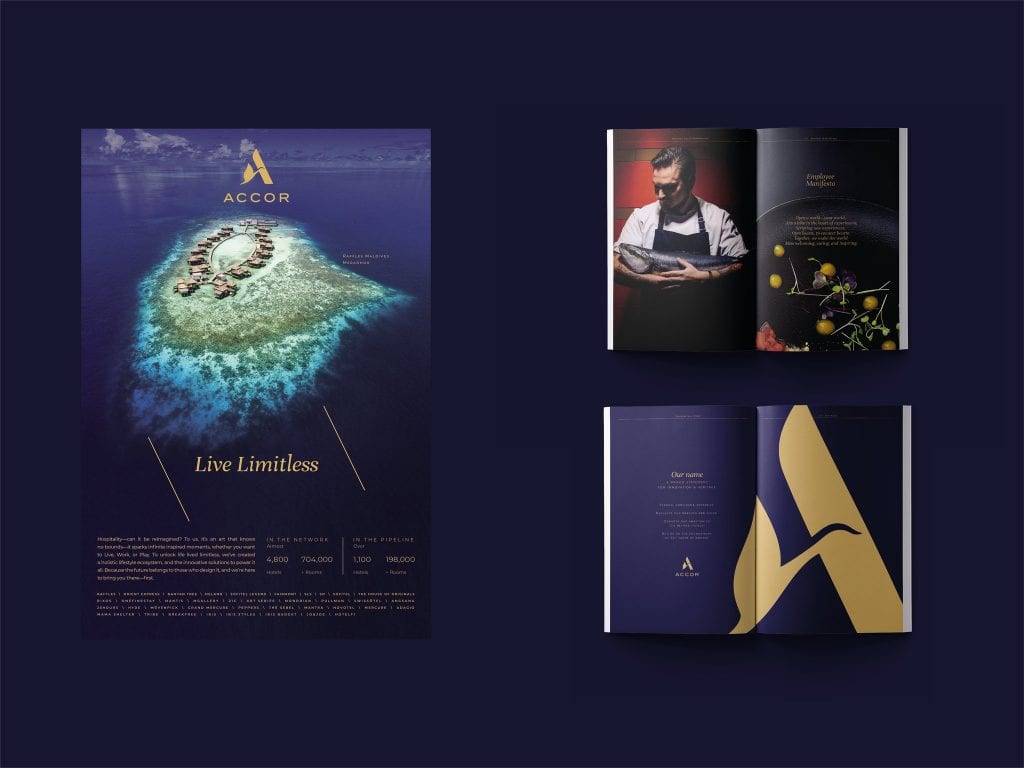
The Accor group contains more than 50 brands and companies: hotels, clubs, restaurants, co-working and tech startups. But the consumer does not see this.
The old Accor logo feels a bit dated, but the swan is a striking and distinctive icon.
The brand wants to clarify its position as a leading luxury and lifestyle hospitality brand. The old logo does not fit very well with that.
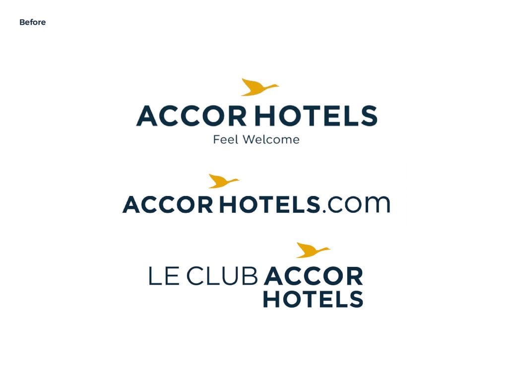
The name Accorhotels was simplified to Accor. So that it becomes easier to become an umbrella brand, under which various expressions are represented.
The new Accor logo is a monogram. The “A” is combined with the swan, a historical symbol of the brand, in 1 uniform shape. You can see it as a seal of excellence.
The new brand identity features a new high-end color palette and refined graphics. A great step in the positioning of this brand.
And it also delivers great results. The immediate impact within four days of the launch of the new identity:
• 7x more social media mentions compared to the daily average
• 75k + social media commitments
• 1 billion (potential) impressions
The marketing materials have also been upgraded and look much more modern & luxurious.
Google Maps rebrand
It is already the 15th anniversary of Google Maps. And recently they have done a revitalization with a new app design and a fresh logo. Instead of a map with a road and a dropped pin, the new logo is now a multi-colored pin.
While the old logo looked too busy, the new one looks much tighter.
Nissan rebrand
Nissan recently updated their logo. The new design is futuristic and minimal, separating the old outdated simulated chrome 3D look and feel. The letters have also been modified and are now thinner and more spaced.
It is in line with what the new logo is made by BMW. You can definitely see a trend in the car design industry to modernize their brand image by using simpler shapes.
BMW redesign
The BMW logo, which dates back to the company’s inception in the 1930s, has been redesigned. They have kept the white and blue, which is symbolic of a propeller on a blue sky. This refers to their history as an aircraft manufacturer. The colors refer to the region they come from. Combined, it forms the basis of a great brand story.
This fresh design retains the crucial parts, but erases the thick black border. The logo is actually transparent, which makes it look different depending on the color of the car it’s on. So there is also much more dynamism.
As you may notice, the name has disappeared. The company does not require it in the logo because their brand has become so strong that it is no longer needed.
The trend of flat logos was started by MINI. In June 2015 it was one of the first car brands to change its logo to a flat design. The new minimal logo is a 2D, monochrome version of the 80s double-winged symbol.
And a personal project I’ve worked on is the rebranding of my employer Karo. The rebranding was done with Studio C (Denmark).
The old logo
The new logo certainly stands out in the pharma industry.
Take a critical look at your brand. Could it be rebranded?