The findings from this edition come from my Brand Walks in Stockholm. The idea: exploring the city on foot, capturing striking brands and marketing communications. I am happy to share this ‘scrapbook’ and hope that it will inspire you for branding and marketing your own brand.
1.
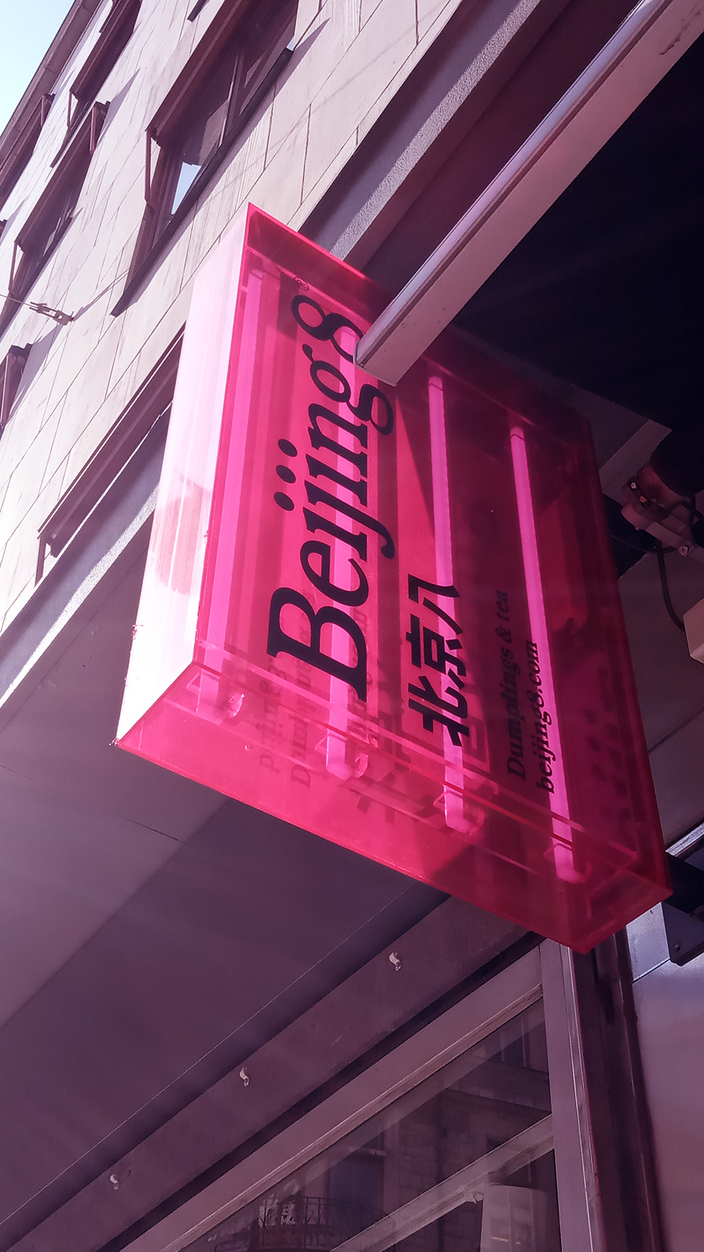
The pink Neon sign of Beijing8 immediately stood out in a busy shopping street. Beijing8 has its own version of traditional Chinese food culture with their dumplings and tea, which they call slow fast food. The brand gives a nice nod to the image of a busy Chinese city.

2.
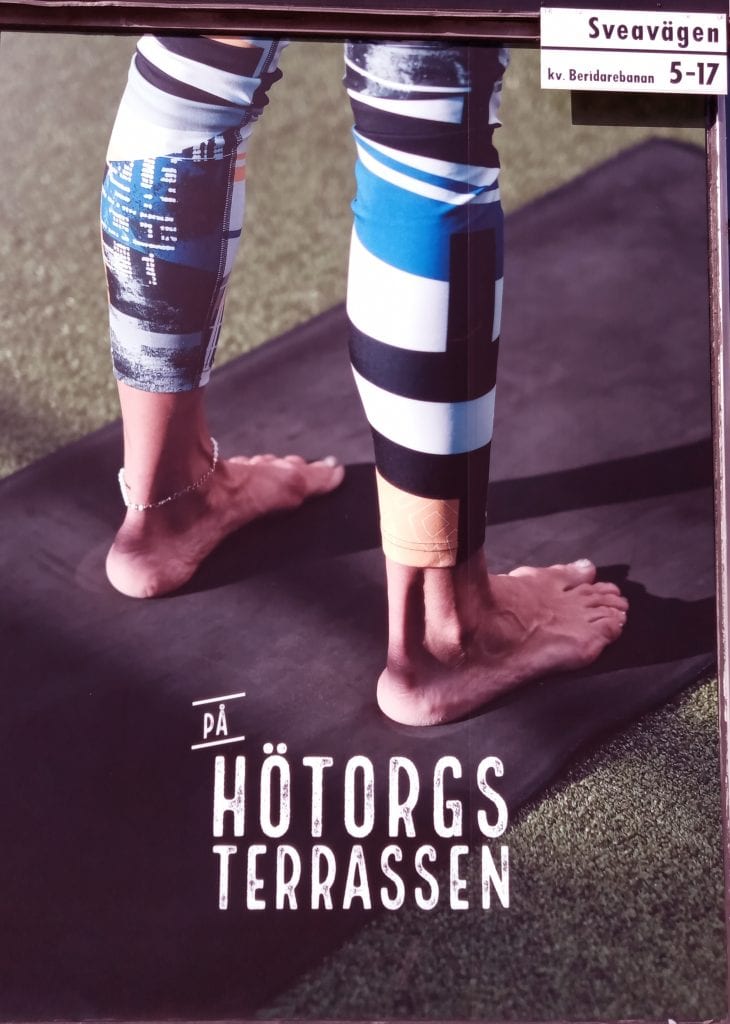
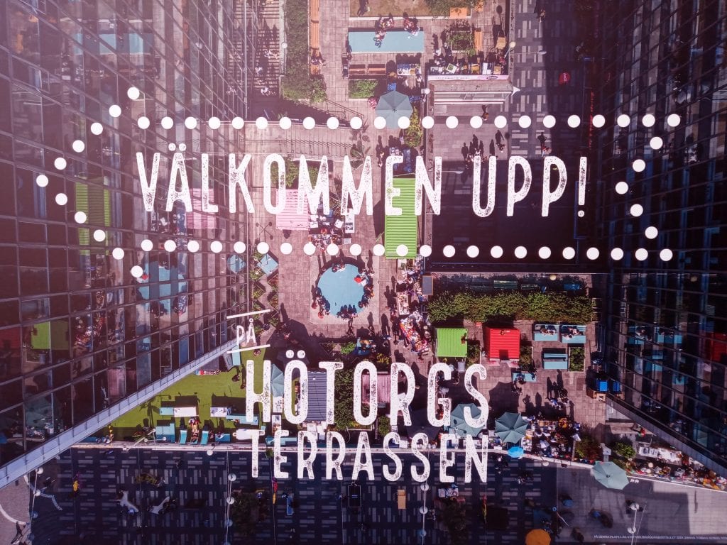
Hötorgsterrassen – food trucks, yoga, zumba, exhibitions, and more. You can find it all in a hidden garden, right in the heart of Stockholm. The roof garden is hidden between 2 of 5 high towers, known as Hötorgsskraporna (try to pronounce that). The marketing for it can certainly be called striking. Various posters in the area tell you what you can do upstairs and inspire you to pay a visit.
3.
Petit Marche – is a small, charming, flower and coffee shop. The concept alone is already well thought out! The branding fits the store perfectly. It supports the feeling they want to convey.
Their logo is literally a drawing of their recognizable shop.

4.
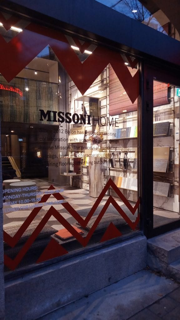
The Missoni brand has a store in Stockholm. It is known for the very distinctive colorful chevron pattern – which they use consistently well. In the decoration of the store, as an element on the website, and even in their products.

5.
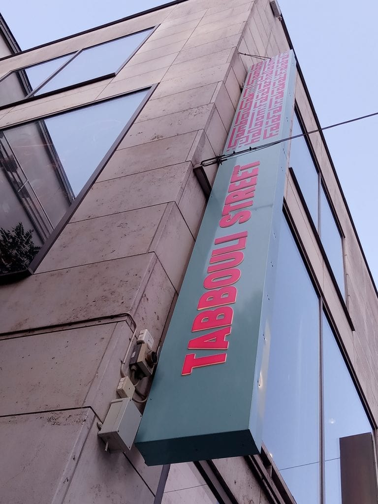
The Tabbouli Street sign is noticeable, but the vertical letters are difficult to read. In addition, it is unclear what you will find here. It is about Lebanese street food. The word ‘food’ is hidden in the last T – which is completely unnoticeable on the signboard. Had they written the word ‘Food’ behind it, it would have been better in terms of communication.
6.
Rice‘s pavement sign catches the eye with its playful logo. And you immediately know what kind of food you can expect here.
They have an Instagram account, but are not active with it. A missed opportunity.
That was it for Found by Frank this time. In the next edition: findings from Copenhagen.